Newswise — BINGHAMTON, NY -- New animations created by a complex systems researcher at Binghamton University, State University of New York improve upon typical COVID-19 visualizations, showing how cases have changed over time and space.
Hiroki Sayama, professor of systems science and industrial engineering at Binghamton University, has created geographical animations of COVID-19 cases using data obtained from the Johns Hopkins University CSSE COVID-19 Data Repository.
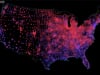
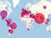
The visualizations show how the numbers of new COVID-19 cases changed over time and space. The COVID-19 activity in each county (for the US version) or country/region (for the global version) is visualized as a disc whose size represents the number of new cases (7-day average) and color indicates whether the number is growing (red) or declining (blue). The animations have been featured in a documentary by German news channel WELT, among other outlets.
“The motivation behind these visualizations was that I was not quite satisfied with other more typical COVID-19 visualizations that only plotted curves over time for a certain country or region without considering interactions between countries/regions, because, as a complex systems researcher, I knew their interactions in spatial proximity matters a lot in a pandemic,” said Sayama.